A key feature of American Community Survey (ACS) data is that the reported values contain both estimates and margins of error. The margins of error, unfortunately, are often overlooked. After meeting with Ezra Glenn last year I gained a new appreciation of them. Today I’ll demonstrate how to visualize them, as well as how they tend to increase as you “zoom in”.
In this example we’ll use the 2011 5-year estimates for per capita income (table B19301). We’ll start at the State level and then zoom into Counties in California and finally Tracts in San Francisco County. If you want to run this code yourself you should first get a Census API Key.
State Income Estimates
library(acs)
states     = geo.make(state="*")
state_data = acs.fetch(geography = states, table.number="B19301")
plot(state_data,
     main = "2011 State Per Capita Income Estimates\n95% Margin of Error")
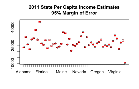
In this case the margins of error are so small that you can barely see them. Note that you can also view the data numerically:
> head(state_data)
ACS DATA:
 2007 -- 2011 ;
  Estimates w/90% confidence intervals;
  for different intervals, see confint()
           B19301_001
Alabama    23483 +/- 110
Alaska     31944 +/- 423
Arizona    25784 +/- 125
Arkansas   21833 +/- 160
California 29634 +/- 90
Colorado   30816 +/- 181
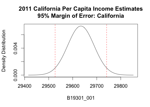
There is also a special visualization if you plot a single state:
plot(state_data["California",], main = "2011 California Per Capita Income Estimates\n95% Margin of Error: California")
County Estimates in California
We can repeat the exercise for counties in California like this:
counties    = geo.make(state="CA", county="*")
county_data = acs.fetch(geography = counties, table.number="B19301")
plot(county_data,
     main = "2011 California County Per Capita Income Estimates\n95% Margin of Error")
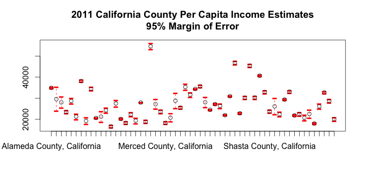 Here it’s clear that the Census bureau is much less certain about some of the counties. As before, we can also look at the data numerically:
> head(county_data)
ACS DATA:
 2007 -- 2011 ;
  Estimates w/90% confidence intervals;
  for different intervals, see confint()
                             B19301_001
Alameda County, California   34937 +/- 290
Alpine County, California    29576 +/- 4775
Amador County, California    28030 +/- 2176
Butte County, California     23431 +/- 550
Calaveras County, California 28667 +/- 1109
Colusa County, California    21271 +/- 1106
You can view the distribution of a single county like this:
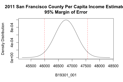
plot(county_data["San Francisco County, California",], main="2011 California County Per Capita Income Estimates\n95% Margin of Error")
Tract Estimates in San Francisco County
We can repeat the exercise for Tracts in San Francisco like this:
tracts = geo.make(state="CA", county=75, tract="*")
tract_data = acs.fetch(geography=tracts, table.number="B19301")
plot(tract_data, main="2011 San Francisco Tract Per Capita Income\n95% Margin of Error")
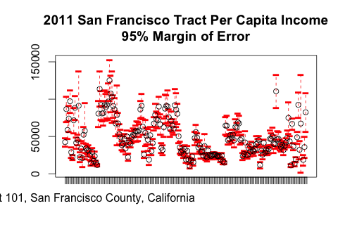
The margins of error of some of these estimates are extremely large:
> head(tract_data)
ACS DATA:
 2007 -- 2011 ;
  Estimates w/90% confidence intervals;
  for different intervals, see confint()
                                                   B19301_001
Census Tract 101, San Francisco County, California 42444 +/- 4798
Census Tract 102, San Francisco County, California 86578 +/- 14030
Census Tract 103, San Francisco County, California 58726 +/- 10033
Census Tract 104, San Francisco County, California 73956 +/- 14691
Census Tract 105, San Francisco County, California 97215 +/- 12423
Census Tract 106, San Francisco County, California 28851 +/- 5878
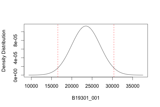
As an example of looking at a single tract, we can use 124.02, which is the tract for San Francisco City Hall. I learned this by first googling for the address of SF City Hall and then using this page from the US Census Bureau to find the census tract of a specific address.
plot(tract_data["Census Tract 124.02, San Francisco County, California",])
Wrapping Up
Writing this blog post has been on my mind for a while. The nature of ACS estimates – a single value together with a margin of error – was a key theme in my meeting with Ezra in November. I hope that this post causes some of my readers to check the margin of error before reporting ACS results to others, especially when dealing with small geographies such as Tracts and ZIP Codes (ZCTAs).
To learn how to easily visualize this data with maps, take my free course Learn to Map Census Data in R.