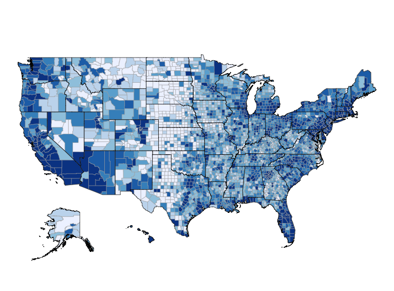
Today I will demonstrate how the margin of error in American Community Survey (ACS) estimates grow as the size of the geography decreases. The final chart that we’ll create is this:
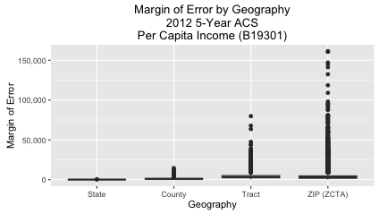
The way I interpret the above chart is this: The ACS is very confident about its state-level estimates. It’s a bit less confident about county-level estimates. But when you get down to tract and ZIP Code (ZCTA) level estimates, though, the margin of error sometimes increases sharply.
Why is the American Community Survey (ACS) Important?
I spend quite a bit of time on this blog talking about ACS data. The reasons are:
- Availability: The census bureau has an API for the data, and Ezra Glenn has written an R package (acs) for getting the data into R.
- Interest: The survey tells you all sorts of interesting information about Americans (race, income, education, etc.).
- Importance: Over $400 billion in federal and state funds are allocated each year based on the survey (link).
So if you want to analyze an important, contemporary dataset for free, I think that exploring ACS data in R is a good place to start. Also, I have my own mapping project in R (choroplethr). And because ACS data has a geographic component, I can easily use it in my examples.
What does Margin of Error Mean?
Wikipedia does a better job of explaining it than me (link). But the gist is this: The ACS only interviews about 1% of US households each year. Because they are sampling the population, they do not have complete knowledge about the population. As a result, each reported value has both an estimated value and a margin of error. In this case, they are 90% sure that the estimated value lies within the reported estimate +- the marign of error.
The above boxplot shows that the margins of error for states and counties is low. But for tracts and zip codes there are sometimes outliers that are extremely high.
Implications for Mapping
My mapping package choroplethr is popular in part because of its support for ZIP Code maps maps. In fact, in my free course Learn to Map Census Data in R I teach people how to make maps like this:
library(choroplethrZip) # on github
data("df_zip_demographics")
df_zip_demographics$value = df_zip_demographics$per_capita_income
zip_choropleth(df_zip_demographics,
               "San Francisco Metropolitan Statistical Area",
               "Per-capita Income",
               msa_zoom = "San Francisco-Oakland-Hayward, CA")
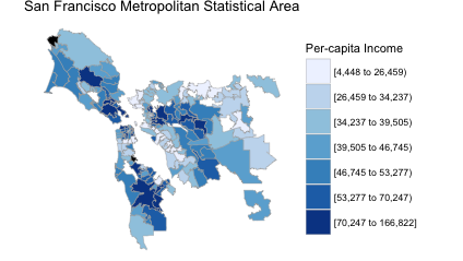
Like most choropleth maps, the colors are based on estimates alone. That is, the margins of error are thrown out. This might or might not be problematic – it really depends on how large the margins of error in these particular ZCTAs are.
New Version of Choroplethr
The latest version of choroplethr (3.5.0) makes it easier to get the 90% margin of error of ACS estimates. Function ?get_acs_data now has an optional parameter, include_moe, that defaults to FALSE. If set to TRUE, the returned data frame will include a column with the 90% margin of error:
> df_zip = get_acs_data("B19301", "zip", endyear = 2012, span = 5, include_moe = TRUE)[[1]]
Warning message:
NAs introduced by coercion
>
> head(df_zip)
  region value margin.of.error
1  00601  7283             561
2  00602  8247             750
3  00603  8913             489
4  00606  6025             692
5  00610  7786             398
6  00612 10203             614
Making the Boxplot
Now that we know how to get the margin of error of estimates, we can create the boxplot that began this post:
library(choroplethr) # version 3.5.0
# B19301 - Per Capita Income: Per capita income in the past 12 months (in 2012 inflation-adjusted dollars)
df_state = get_acs_data("B19301", "state", endyear = 2012, span = 5, include_moe = TRUE)[[1]]
df_state$region = NULL
df_state$geography = "State"
df_county = get_acs_data("B19301", "county", endyear = 2012, span = 5, include_moe = TRUE)[[1]]
df_county$region = NULL
df_county$geography = "County"
library(choroplethrZip) # on github
df_zip = get_acs_data("B19301", "zip", endyear = 2012, span = 5, include_moe = TRUE)[[1]]
df_zip$region = NULL
df_zip$geography = "ZIP (ZCTA)"
library(choroplethrCaCensusTract) # on github
library(acs)
df_ca_census_tract = get_ca_tract_acs_data("B19301", endyear = 2012, span = 5, include_moe = TRUE)[[1]]
df_ca_census_tract$region = NULL
df_ca_census_tract$geography = "Tract"
# combine and remove NAs
df = rbind(df_state, df_county, df_zip, df_ca_census_tract)
nrow(df) # 44371
df = na.omit(df)
nrow(df) # 43753
df$geography = factor(df$geography, levels = c("State", "County", "Tract", "ZIP (ZCTA)"))
library(ggplot2)
library(scales)
ggplot(df, aes(geography, margin.of.error)) +
geom_boxplot() +
    ggtitle("Margin of Error by Geography\n2012 5-Year ACS\nPer Capita Income (B19301)") +
    labs(x="Geography", y="Margin of Error") +
    scale_y_continuous(labels=comma)