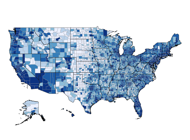
Python Census Explorer v1.2.0: Census Tracts
I just updated my Python Census Explorer app. You can view the new version by visiting census-explorer.streamlit.app or clicking the image below:

Major Change and Project Goal
My long-term goal with this project is to explore how neighborhoods across the country changed during Covid-19. Previously the app showed selected demographics of all counties in a given state. I think that Counties are too large a geographic unit for people to feel an attachment to, and wanted something smaller. It’s not clear that “tracts within a given county” is the optimal granularity, but I do think that it’s an improvement.
Long-time readers are likely familiar with the Census “geographic hierarchy”:

Tracts are useful because everyone knows the county they live in, and they are directly below counties on the geographic “spine”. This means that all tracts “nest” within a county.
That being said: I first experimented with County Subdivisions. They work well in San Francisco county, and their names even correspond to the names residents use! However, when I looked at counties in New York City I was disappointed that they have no County Subdivisions at all 😞. In the interest of expediency I decided that Tracts are good enough for now, and marked this as something to revisit later on.
Smaller Technical Changes
I regularly hear from readers who are interested in improving their technical skills. As such, I thought that going into more detail about the technical changes in this version might be of interest.
- A big thank you to Ramnath Vaidyanathan for doing a code review! Ramnath has made many wonderful contributions to the R ecosystem. And he is much further along the “learn Python as well as I know R” road than I am. He suggested that I use Python modules to split my code into multiple files (specifically a “front end” and “back end”). This was my first time using modules and I found them to be a great way to make my code easier to read; you can learn more about them here. The backend module is here and the front end code is here.
- Longtime readers will know that I am using the censusdis package to interact with the Census API. While I could be wrong, I don’t think that censusdis is designed to answer questions like “What are all the counties in a given state?” Unfortunately, this question is necessary for the second dropdown menu to work. My solution was to write
choroplethrMaps::county.regions to a CSV file and have the app read it. That code can be found here. - I changed Visualization 1 from a table to a boxplot. A table makes sense when dealing with counties in a state, but not tracts within a county. The reason is that there are simply too many tracts, and they don’t have names that residents recognize. I wound up using the graphics library Seaborn for this. As a longtime R user I find it odd that there are so many graphics libraries in current use in Python (people seem to agree that they shouldn’t use Matplotlib, but don’t agree on what they should use). In R people just use ggplot2 🤷♂️ I chose Seaborn for the boxplot for no particular reason and you can see the code here.
- Thank you to “CensusCharles” for opening the first issue in the repo. I actually noticed the issue he raised, but figured that I’d ignore it until someone mentioned it 🙂 The issue wound up being fairly straightforward to solve and I’m glad it’s fixed.
- When people come to me with programming questions they are often surprised if I get stumped and say something like “I don’t know the answer. I recommend asking on StackOverflow”. And then they don’t ask on StackOverflow and the issue never gets resolved 😂. In the spirit of leading by example I’ll point out that this is the second time on this project that I got stumped and had to ask on StackOverflow. You can see my question here, and I’d like to thank Darren Vengroff for answering it so quickly!
- I made the map default to San Francisco because what’s the point of having your own project if you can’t do things like that?