Visualizing the Impact of Covid-19 on US Counties
I just published a new version of my Python Census Explorer app. This version lets you select a State, County and Demographic statistic. It then presents two visualizations of the data over time:
- A standard line graph of the raw data
- A bar chart showing the year-over-year percent change
The app defaults to visualizing Total Population for San Francisco County, California:
The data comes from the 1-year American Community Survey (ACS), which covers 2005-2022. Note that data is only provided for counties with a population over 65,000. Due to Covid-19, data was not published for 2020.
My hope is that before reading further you take a moment to visit the app, enter in your own county, and see what the data says about where you live. I’m particularly interested to know how the visualizations you see compare to your recollection of how your county changed at the time.
In my case, I vividly recall large numbers of people moving out of San Francisco during Covid. So the 8% drop in total population did not surprise me. But seeing that change in the context of the entire dataset (which shows that San Francisco has generally been growing since 2005) did stand out to me. Even among the few years when SF did shrink, the intensity of the 2021 drop was truly unprecedented.
New Variable: Number of People who Worked from Home
In this version of the app I also added in a new variable: total number of people who worked from home. As you can see below, the number of people in San Francisco who worked from home increased 400% between 2019 and 2021! While I expected an increase, I had no idea how large the number would be. And again, the intensity of the spike in the context of the entire time series surprised me.
Whence Tracts?
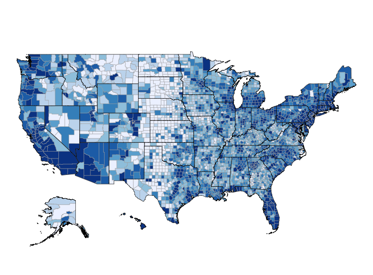
Longtime readers will recall my last post, where I had the app visualize the demographics of Census Tracts in a given year:
My goal at the time was to add in a “percent change” visualization showing how a given demographic changed before and after Covid. Unfortunately, I quickly learned that I could not extend the tract-level analysis in that way:
- Even though I was visualizing “2022 data”, the dataset was technically the 5-year ACS, which covers survey results from 2018-2022. You cannot compare “overlapping” datasets. That means that the “closest” ACS I could compare changes with would be the 2017 5-year ACS. I view Covid as a sudden, dramatic change to society. And I thought that looking at 5-year spans simply wouldn’t capture what I was interested in.
- The 1-year ACS does not report tract-level data. It only goes as small as counties. And even then, it only reports data on counties with a population greater than 65,000.
- Tract boundaries changed in 2020. Since the change I am most interested in is 2019 and 2021, even if I could compare tracts, it would lead to another significant problem that doesn’t have an obvious solution.
I have several ideas on how to improve this app. But my purpose in this post is to try and get more people to simply use and provide feedback on it. If you have any thoughts you’d like to share after using the app, please feel free to contact me to share them!


